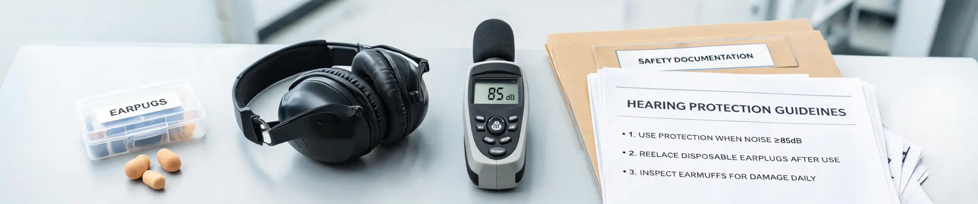
Last Tuesday, I did the thing I do most mornings: pulled a few random boxes from a pallet of Howard Leight earplugs and put them on the inspection bench. It's a boring job until it isn't.
I'm a quality and brand compliance manager at a PPE supply company. I review products before they go out the door—hearing protection, safety glasses, fall protection, respirators. In a typical year, that's 200+ unique items. In 2024, I rejected about 8% of first deliveries. The usual reasons: labeling mistakes, missing paperwork, or logos that don't look right.
This batch was different because the product itself was fine. The foam was the right density. The NRR 33 documentation was in order. The pouches were sealed. But something about the Howard Leight logo on the outer carton looked off.
The Color Problem
I can't explain why I stopped. Maybe because I've looked at that logo on hundreds of boxes. It's a simple wordmark, but it has a certain weight. On this one, it looked thinner. Or bluer. Or something.
I grabbed a known-good box from the previous lot and placed both under daylight. My first thought was that I was imagining it. Then I ran a color spectrophotometer and compared the readings to our approved brand standard. The new cartons were at Delta E 3.8 off. Industry standard tolerance for brand-critical colors is Delta E under 2. From 2 to 4, a trained eye can see the difference. Above 4, most people can. (Source: Pantone Color Matching System guidelines, pantone.com.)
We also check resolution and file setup. On packaging, a logo should be vector-based or a clean raster at 300 DPI at final printed size. That's a commercial print standard. If I see a 72-DPI screen grab, I know the packaging was put together as an afterthought.
"It's within industry standard," the vendor's quality rep said.
To be fair, he wasn't entirely wrong. For a brochure or an internal sign, a Delta E of 3.8 might pass. But this was the Howard Leight logo on consumer-facing packaging for a hearing safety product. Safety managers don't buy earplugs because the box is pretty. But they do connect quality with the brand. If the logo looks faded or off-color, a small part of their brain asks what else might be off.
Two Other Reminders About Perception
That mindset got reinforced the week before, when our marketing guy showed me the search terms that led people to our product page. Some made sense: "howard-leight", "howard leight earplugs", "walker hearing protection". Then there was "handcuffs clipart". A stock photo on one of our pages looked enough like a handcuff illustration to pull in the wrong crowd. We changed the image. It was a reminder that every visual you put out—logo, packaging, even a silhouette in a photo—shapes how people see your brand.
Something similar happened at a safety expo a few days earlier. Someone in a hi-vis vest walked up and asked, "can you take pepper spray on an airplane?" It's a fair question, but it wasn't my area. I'd rather say "I don't know, let's check the TSA website" than make something up. That's the same instinct that made me stop on the logo. It's easy to wave things through. It's harder to say "this doesn't feel right, let's verify."
The Hard Part
Back to the earplugs. I had two hours before the distributor's truck cutoff. Normally I'd sample across all pallets and run a full visual/color audit. There wasn't time. But the color data was enough on its own. I rejected the batch.
In hindsight, maybe I could have approved the product and arranged for replacement cartons later. But with the schedule and the fact that these units were going straight to a customer, I made the call with incomplete information. It wasn't a perfect decision. It was a defensible one.
The distributor wasn't happy. The vendor wasn't happy either. After a tense call, they agreed the logo didn't match the approved proof. They reprinted the cartons at their cost and delivered a replacement lot three days later. We avoided putting 50,000 units into the market with a compromised brand mark. The reprint itself didn't cost us, but the schedule disruption was real. It was still cheaper than shipping 50,000 boxes to a customer and trying to explain why the logo looked off.
What I'd Tell a Buyer
What did I learn? That "within tolerance" and "right" are not always the same. In PPE, actual protection—NRR, ANSI ratings, certifications—is non-negotiable. But brand perception matters more than most people want to admit. When a customer opens a case of Howard Leight earplugs, the first thing they see is not the foam. It's the logo. If that looks careless, they start questioning the product even if the product is perfect.
We now write Delta E targets into supplier contracts for all printed packaging. We also check the logo before anything else, because if the brand mark is wrong, it tells me the vendor isn't paying attention to details.
Quality is more than function. It's the signal a product sends before the user reads the specs. That's why I'll keep rejecting batches for things some people call cosmetic. A logo is not just a logo. It's the first piece of evidence a customer has about whether you can be trusted.
To be clear, my experience is based on roughly 200 incoming PPE products a year, and most of my inspection work relates to hearing protection and other Howard Leight items. If you're working with a different brand or a different category, your failure points might be different. And this approach worked for us because we're a mid-sized distributor with stable supplier relationships. If you're buying one-off orders or don't have the leverage to push back, the calculus might be different. Sometimes you have to accept a mismatch because the alternative is an empty shelf.
If you're responsible for specifying or buying PPE, look at your packaging the way a customer would. Check the logo. Check the colors. Check whether it looks like the same brand on the company website. And if something feels off, trust that feeling. The product inside might be perfect. But the story the packaging tells is part of the product.
And if you ever find "handcuffs clipart" in your search terms, don't ignore it. That's your brand telling you something.

Maeve Callahan
Maeve Callahan is a head-protection analyst covering Type I and Type II hard hats, climbing-style safety helmets, bump caps, chin straps, suspensions, liners, and face-shield carriers. She applies ANSI Z89.1, EN 397, and EN 12492 criteria while comparing impact attenuation, penetration resistance, lateral deformation, electrical class, retention strength, field of vision, mass, fit range, and temperature conditioning. Her guides help EHS teams, contractors, utilities, and buyers select helmet systems for overhead hazards, work at height, electrical exposure, accessory compatibility, and worker acceptance.